Hi my friends! It has been SOOOOOOOOOOOOO long, YEARS, since I’ve written a blog post, so this is exciting! Not only is this my first blog post in forever, but it is my first styling client EVER (that’s not myself, haha). Okay, so let’s jump right in!
Almost a year ago, I decided that after YEARS of wanting to start a styling business, I was going to just do it. I put the word out, and immediately, my friend that I’ve known for years said she wanted me to come over and help her with her house. I’ve been to her house many times over the years, but no impression ever stuck, except that she has a great house and layout, and I remembered I loved the big yellow sectional in her living room. Oh, and she has a great new kitchen. So, we set up a time for me to go over to her house so we could discuss what she needed and wanted. EEEK! I was SO excited to have a real official client!
The client: I met Kimmy about 19 years ago (gulp! how has this much time passed?!) when I started dating my husband. They had been friends for years, and so I inherited this great human being through him. Kimmy is a super fun, super friendly, super social, super busy gal who has hosted tons of parties at her house over the years. She’s a lawyer, but the not terrible kind :) Also, she is recently divorced and has two bubbly fun kids. So, that means that she can change up her house to make it ALL hers, however she wants it, without having to compromise on anything! Yay!
The situation: As we were walking through her house, she had several projects that she wanted to work on. Her living room, her dining room, her entryway, the “loungey” area of her kitchen, and her bedroom. Looking around her home and she had very strong feelings about it. Most of those feeling can be summed up in a phrase she used a lot in showing me things. “I hate this. This just stresses me out.” She had hated it for years, but like many people, she just ignored it and continued to live in the spaces as they were because she has a full life going on and no time to dedicate to doing something about it. Plus, not knowing what to do to change it, or even how to start makes it even harder. So, we started with her living room.
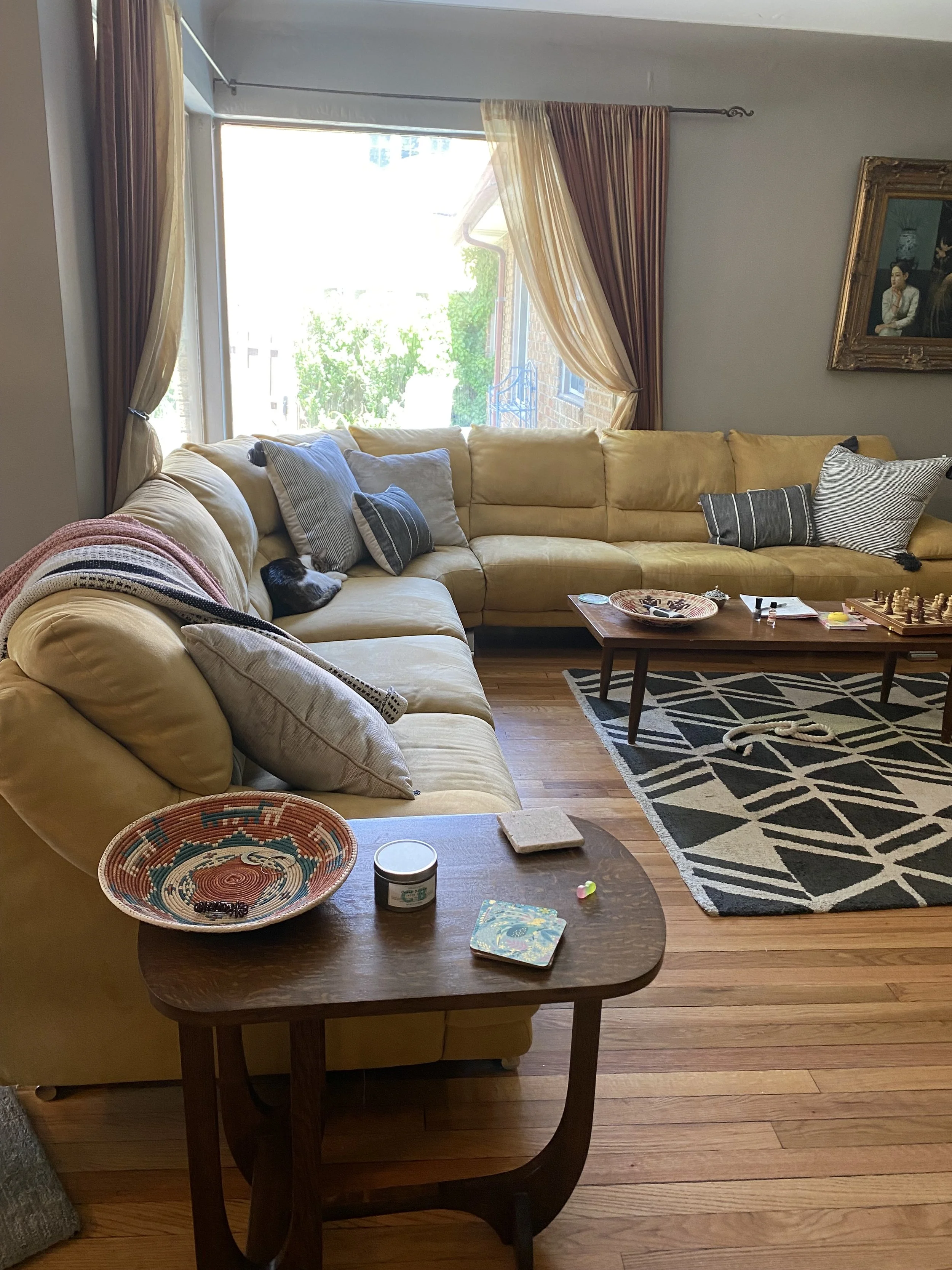
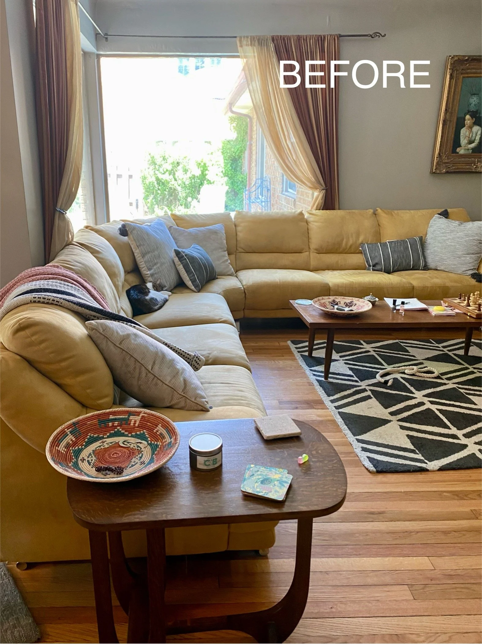
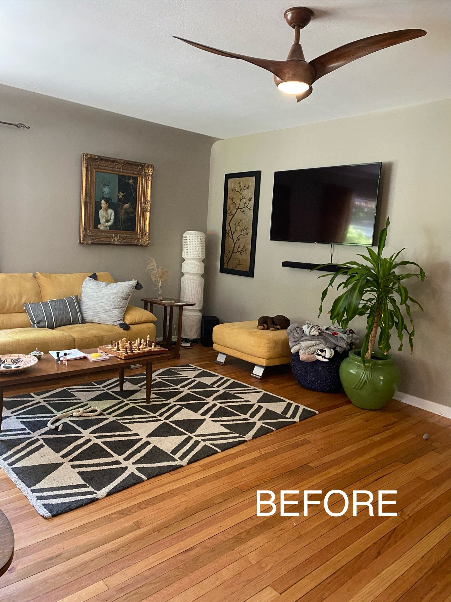
The room: Okay, so here are the before pictures of her living room.
I took these pictures the first time we talked about it. Kimmy HATED this room and said she avoided spending time in here. I asked her what she was open to changing, and what she wanted to keep. Here’s the list:
Keep
Sectional: It’s huge and it was expensive when she bought it.
Side tables: They are vintage and she likes them.
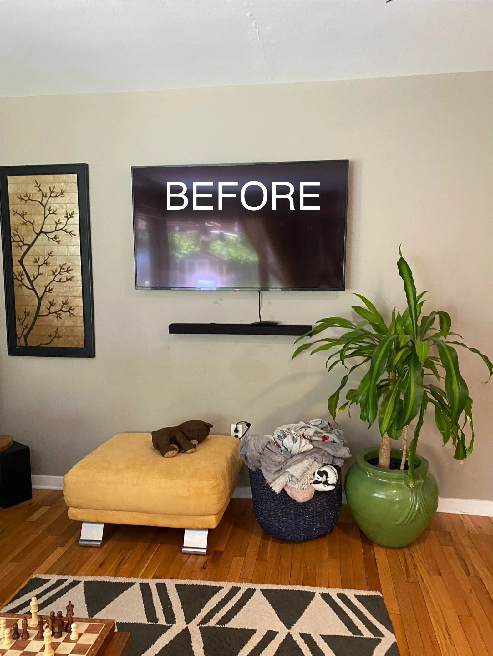
TV: Obviously. The TV and soundbox were installed in the wall, so they are staying put.
Wall color: She adamantly likes this wall color and it’s staying.
The big portrait art piece: Kimmy loves her and she has to stay
Change : Anything else could disappear into the abyss
The ask: Kimmy wanted a space that could be just for her, to have a place to relax and lounge. They have a TV in their kitchen lounge area, so the kids didn’t have to be in here to watch TV. Basically the ask was to make her not hate it. We discussed colors she likes, level of boldness she likes, etc. Like me, she is into color and she likes eclectic. Oh, and she also didn’t want to spend an absolute fortune.
The plan: I had no plan, of course, because this was the first time I was doing this for someone else! So, I told her that I was thinking of just doing what I always do with my own space. Build it slowly over time and go vintage or secondhand as much as possible because 1: it’s better for the planet 2: it’s better for the wallet 3: it’s more unique and eclectic. She was totally on board. Also, ordering and buying over time instead of all at once would be more realistic from a spending perspective and also from a time perspective (which most moms are short on!). So, overall, my only plan was that I was going to turn this space into a place that she absolutely loved and that made her happy instead of a place she avoided.
My thoughts: Even though this space wasn’t what Kimmy wanted at the time, I knew a few things. One, it had major potential. It gets amazing natural light from those huge windows. That big yellow sectional didn’t fit in with the current sad state of affairs in there, BUT, it would fit perfectly into the “happy” space that would come to be because yellow is amazing. So, that yellow would be our jumping off point. And two, Kimmy is such a bubbly and friendly person, and this room was not syncing with that AT ALL. It was just making her depressed to look at it. So, I was going to create a room that matched her personality. Fun, happy, eclectic, and whimsical.
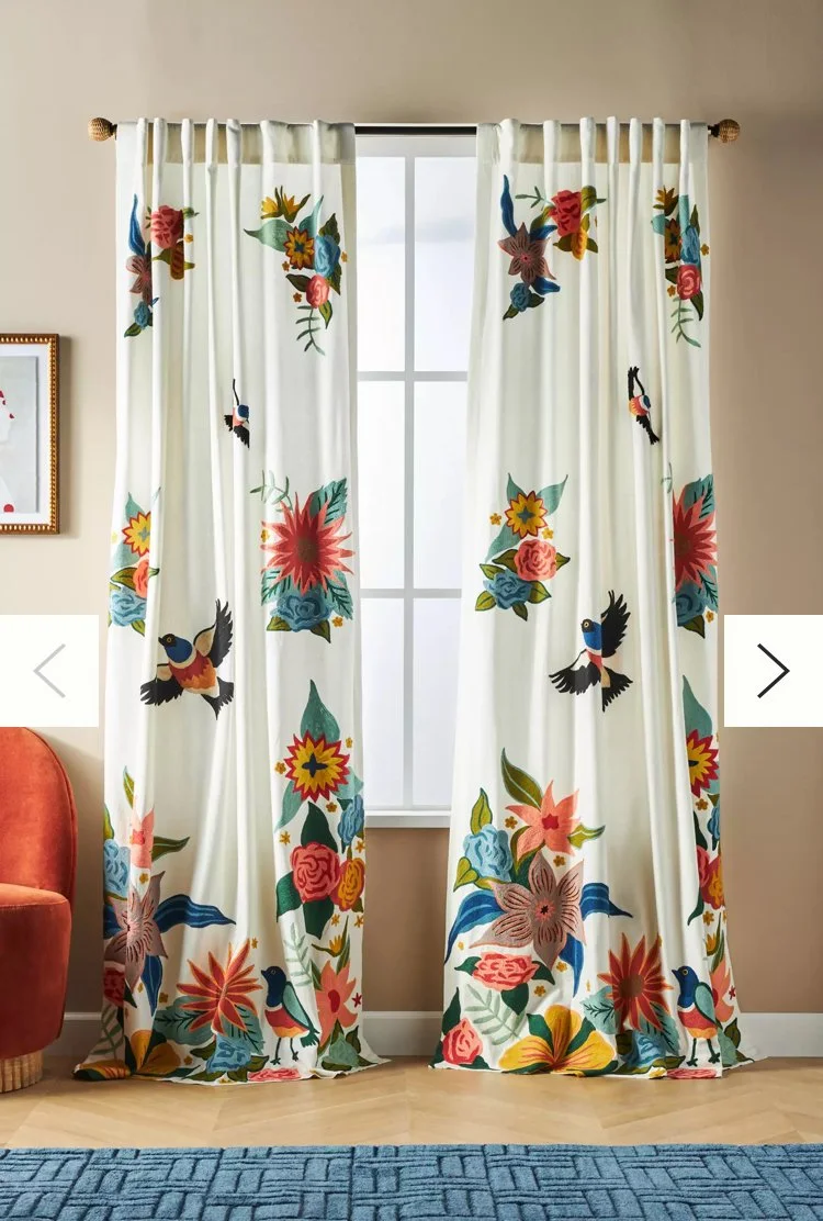
The big changes: So, with yellow being the jumping off point, the first two things that needed to change were the rug and curtains. The current rug was ridiculously too small for that space and that sectional. And those curtains had to go. As far as curtains, I have had these Anthropologie ones floating around in my brain for years because they are fun and vibrant:
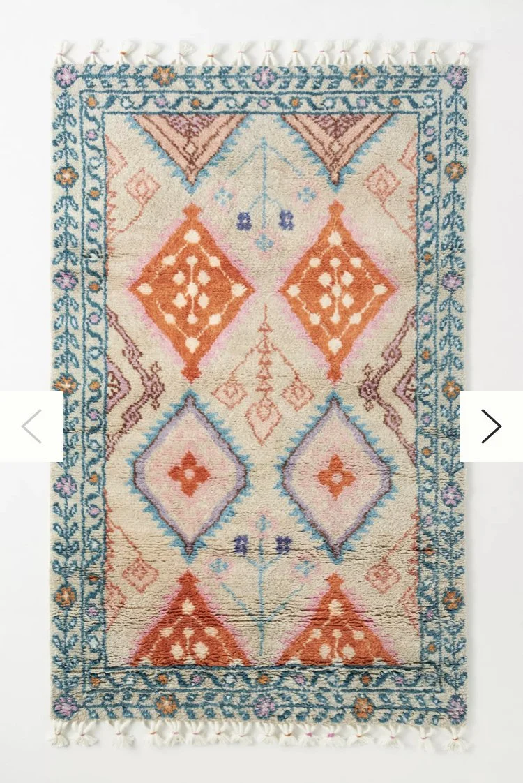
She LOVED these curtains, and ordered them for both living room AND dining room, since both rooms flow into each other. As far as rugs, based on those curtains, I gave Kimmy a bunch of options for rugs that I thought would be good, and this is the one that stood out and she fell in love with:
It is sooooo good. Notice that it doesn’t really “match” the curtains and they are different styles, but they are both colorful and whimsical. You will see that they totally work together when you see that “after”. EEEEEEEEEEEEEEEEK! I’m excited to show you. Anyway, the coffee table. We needed a coffee table that worked with those side tables. I wanted a big round one to fit that sectional space. The long one was not cutting it shape or size wise, and was badly in need of a refinish. I gave her a bunch of options of style and of all of them, she really REALLY liked the drum shape below, which I totally agreed is the best option since we have leggy side tables. So, I started looking for wooden drum ones, secondhand and new. This is what we were planning on at that time:
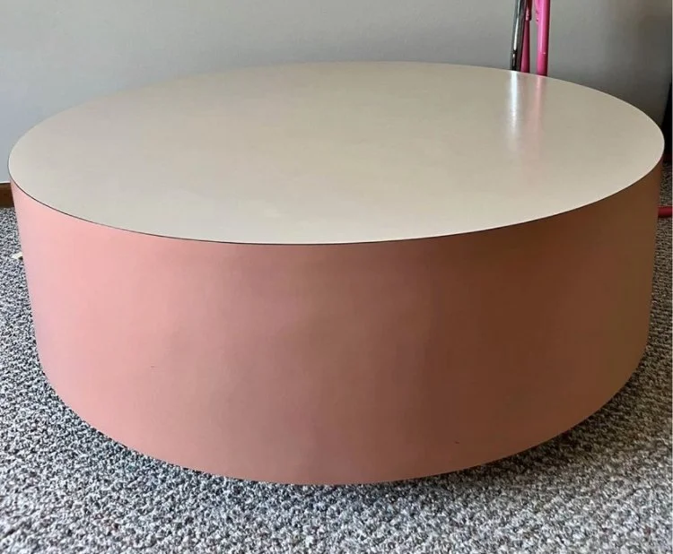
And then, as is usually the case, the universe dropped the MOST EPIC COFFEE TABLE OF ALL TIME in my lap!
If Kimmy said no to this, I was totally just going to keep it for myself because I loved it SO SO SO MUCH. And, AND, AND! It was PINK!!!!!!!! The holy grail. Not only is it the absolute best color of all time, BUT, it would go perfectly with that rug and my theme of “happy”! Also, it was so insanely well priced. Like, WHAT!? So, Kimmy liked it too, based on the meh Facebook Marketplace picture I sent her. Even though the picture was just meh, I knew it could possibly be the best thing ever. And it was in purrrrrfect condition! So, I snagged this behemoth and brought it over. Side story: When I went to pick it up from the seller, she said another lady had tried to buy it before me, but she couldn’t fit it in her car (it’s HUGE), so she VERY sadly had to leave it behind. Clearly it was meant to be for me! After carrying it all around the house to the backyard and through the doorwall due to its size, we plunked it down on that rug, and the heavens parted and angels were singing! Kimmy LOVED it in person so much. Of course she did because it was sooooooooooooooooooooooooooooooooooooooooooooooooooooooooooooooooooo good, and only a crazy person wouldn’t love it. Note: I have dibs on buying it it if she ever goes crazy and decides she isn’t into it anymore.
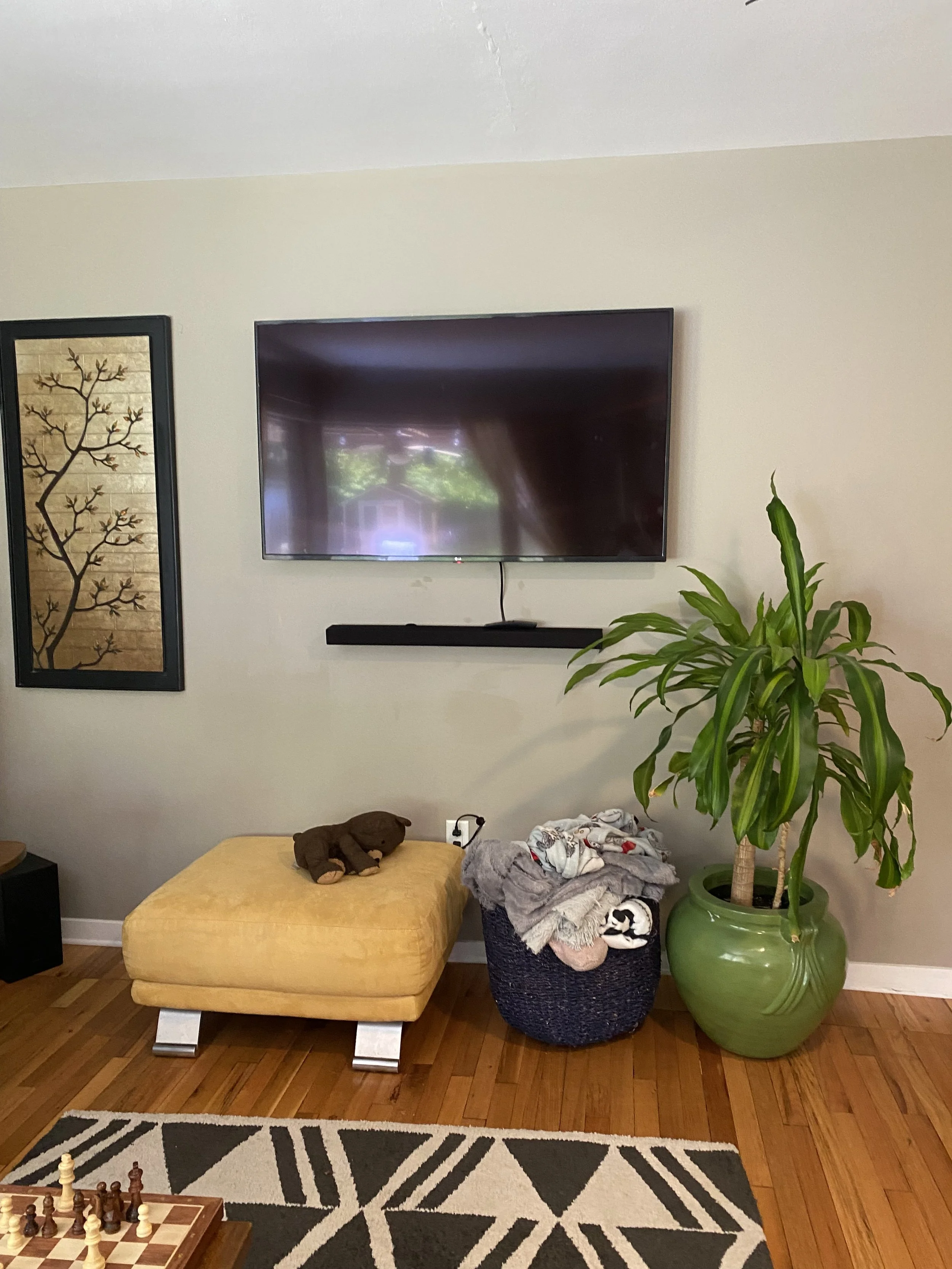
Next up was that TV wall. Reminder:
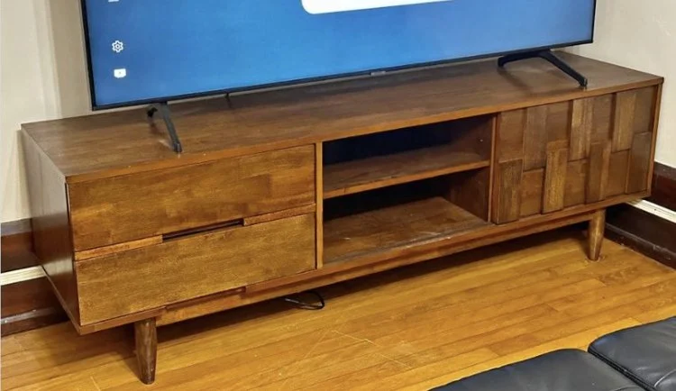
A credenza or TV stand kind of thing needed to go there. So, again, Facebook Marketplace to the rescue! I sent Kimmy lots of pictures of different ones, and this one was in perfect second hand condition, and would look amazing with those side tables. It had a mid century modern feel without being vintage or too retro feeling. Perfect.
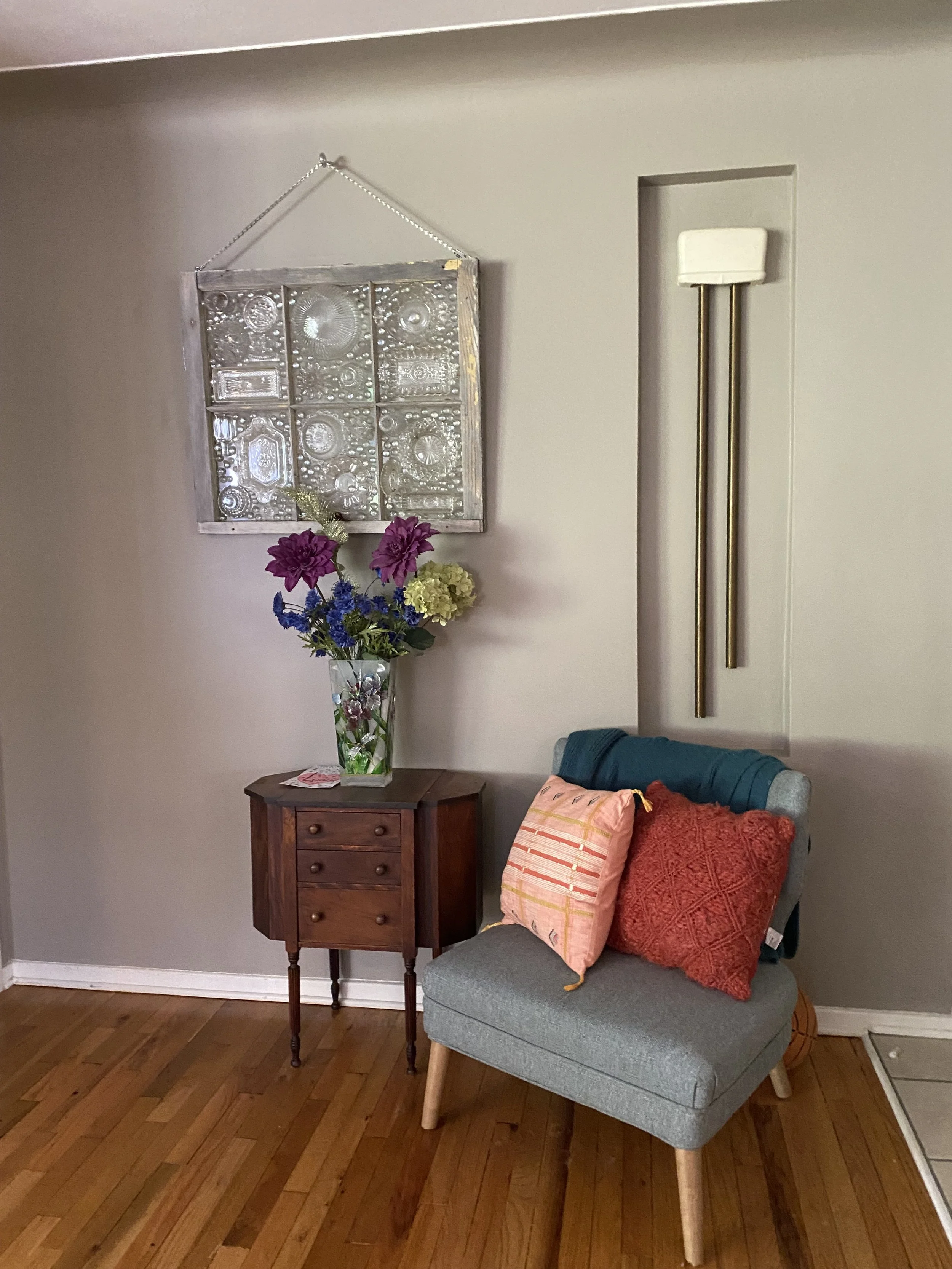
Seating. So, when Kimmy was giving me her original run through of the house and everything she hated about it, she mentioned this one side of the entryway by her front door.
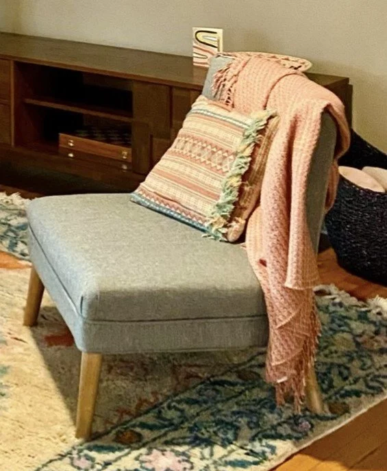
That huge glass piece is an art piece created by her talented mother (how cool is that!?). She loves it, of course, and she said this little antique cabinet can go, but as far as the chair, she just moved her hand in a big circle over it and said, “I hate everything about this.” She wanted to see if we could sell it. It was a dumping ground for clothes in her entryway. We all have “that chair”. Anywho, looking at her living room, I wanted to close the area into more of a “conversation pit” that felt cozier. So, next time I was over there for a progress visit, I told her my conversation pit idea and then moved that chair from the entryway over to the living room. It was a good color for the palette we were doing, and it was free. No need to buy new (or new-to-you) furniture when you can shop your own house! She immediately loved that idea and no longer hated that chair because now it 1) had a purpose, 2) made sense style- and color-wise, 3) was saving her $ since she already had it, and 4) got it out of its original despised spot.
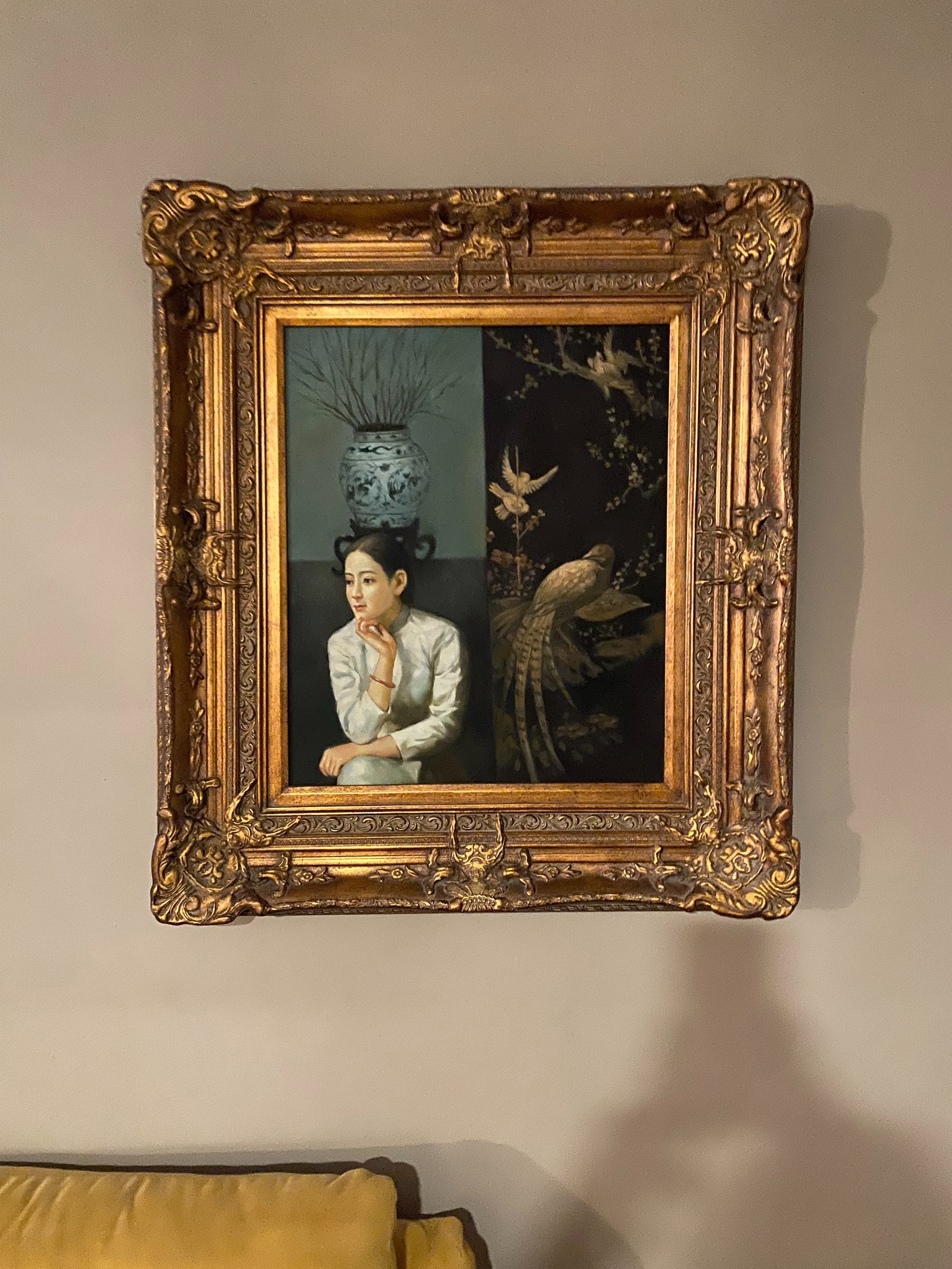
Now, for that big beautiful portrait art piece. Reminder:
So, I like this piece, and Kimmy LOVES this piece. But, this lady is just too pensive and moody for the feeling I wanted to create. So, I asked K if she was open to moving this lady to another space that would be better for brooding. And then I started looking at art. I find a lot of my own art second hand. Or, I should say, they find me. But, while I was waiting for the universe to bring me a great vintage or secondhand piece of art, I knew I had to find a big piece to go in that space and the feel and colors had to bring on that not-drug-induced happy euphoric feeling I was going for. I looked through lots of new art online and sent some over to K. Big new art is expensive. It just is. I fell in love with this piece from Minted (an artist I love and have a few pieces from) and was slowly getting her to agree:
But then. A really great piece fell into my lap AGAIN. And, it costed waaaaaaaaaaaaaay less than the ones I wanted new. I showed it to K and she loved it and LOVED the cost savings, so it was a go. And it really took things in a new direction. Thank you again, universe! Eek! But I’ll show you what it is in the AFTER pictures (coming Friday!). So, I’m going to wrap this very long tale up today with just these notes:
I wanted a gallery wall of art around the TV to fill that space and mix the TV in so it’s not just a big black rectangle on a blank wall. I found all of the art secondhand. I also changed out the floor lamp to match the vibe. K, that’s it for today! No more to share until I show you the final thing FRIDAY!!!
K, byeeeeeeeeeeee! :)
